
Website creation
From your first idea to a website that feels like you.
A practical guide to turning a clear brief into a cohesive design.
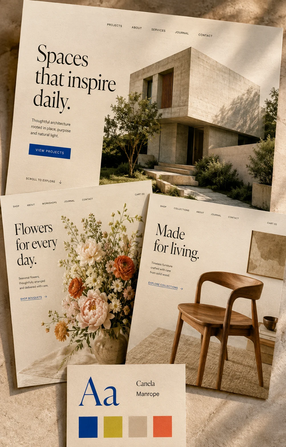
A website often starts with a collection of things you like: a photograph, a colour, a few saved pages. Those references can help, but they rarely tell you what your own site needs to say. Before choosing a layout, spend a little time making your business easier to explain. A clear starting point gives every later decision something useful to work towards.
Write down what a visitor needs to know
Imagine someone hearing about your business for the first time. What do you offer? Who is it for? How does someone take the next step?
Answer those questions in three plain sentences. Avoid language that could describe almost any business, such as ‘thoughtful solutions’ or ‘quality experiences’. A neighbourhood florist might explain that they create seasonal arrangements for homes and small events, deliver locally, and take enquiries through a short form.
This description does not need to become your headline. It is a useful test for the words that do.
Give each page one main job
List the information your visitors will need, then group related pieces together. A homepage might introduce the business and help people choose where to go next. A service page can explain what is included, who it suits, and what happens after an enquiry. A contact page should make getting in touch straightforward.
Start with the pages you can explain confidently. You can add more when there is a clear reason.
For each page, finish this sentence: ‘After reading this, I want someone to…’ If you have several competing answers, simplify the page or separate the information.
Find your style in your own materials
Look at the things already connected to your work: packaging, your workspace, product details, customer questions, or the way you write an email. These can suggest a more personal direction than copying a complete website.
Choose a small set of visual references and note what you like about each. Is it the generous spacing, natural photography, or straightforward type?
Use those observations to guide your choices. Check that text remains comfortable to read and that photographs help someone understand the business.
Review it as someone new
Open your draft on a phone and work through it without explaining anything aloud. Can you understand the offer? Find the practical details? Take the next step?
Ask someone unfamiliar with the business to do the same. Give them a task, such as finding a suitable service, and watch where they hesitate.
Make those moments clearer before adding more decoration. A website begins to feel like you when its words, images, and everyday usefulness all reflect how you actually work.