
Website creation
Design a homepage with a clear next step.
A useful structure for helping visitors find their way.
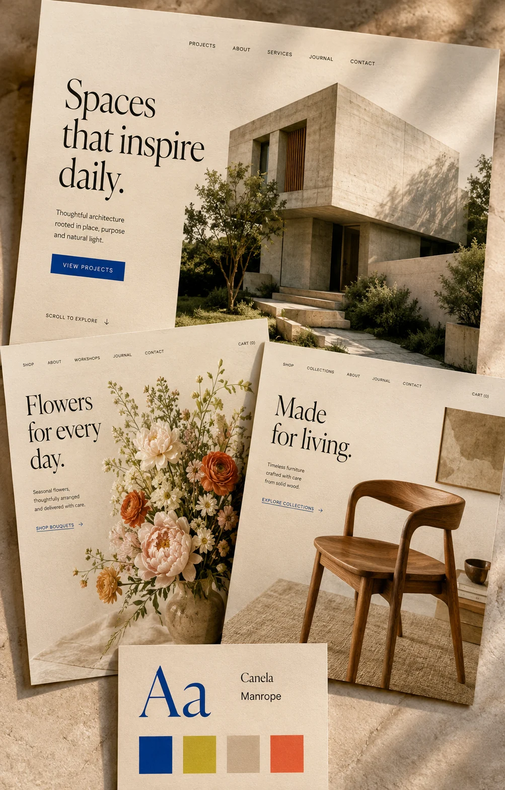
Your homepage does not need to explain everything. It needs to help a visitor recognise that they are in the right place, understand what you offer, and choose a useful next step. A few deliberate decisions can make that journey much easier.
Make the first screen specific
Start with an ordinary sentence about the work you do. An architecture studio might say it designs homes and thoughtful renovations in a particular region. A ceramics studio might introduce small-batch tableware made by hand. Both communicate more than a headline about limitless possibilities.
Use the supporting sentence for the detail that helps someone decide whether your offer fits. Keep the headline and photograph working together: if the text introduces your studio, show its work rather than a decorative image with no connection to the business.
Choose one main invitation
Decide what visitors should do when they are interested. ‘View our projects’, ‘Explore the collection’ and ‘Book a consultation’ describe different next steps. Choose the one that suits how people actually become customers.
Use a secondary link for people who need more context. It should be easy to find without competing with the main action. Repeat the main invitation later where it makes sense, rather than filling every section with a different request.
Let the sections answer questions
After the introduction, show the evidence someone needs: a small selection of projects, a clear service explanation, or practical information about the process. Give each section one purpose and a heading that makes that purpose obvious.
Use genuine examples and only publish testimonials with permission. A useful detail about how you work is better than an unsupported promise. Leave enough space between sections that a reader can recognise a new topic.
Test the route, not just the appearance
Ask someone who does not know the business to find an appropriate service or product. Watch which link they choose and where they pause. Those pauses are useful feedback about labels and missing information.
Repeat the task on a phone. Check that the introduction remains readable, the image crop makes sense, and the next step is comfortably tappable. Improve the first point of confusion, then try the journey again.