
Design & branding
Your brand is more than a colour palette.
Give every page a recognisable point of view.
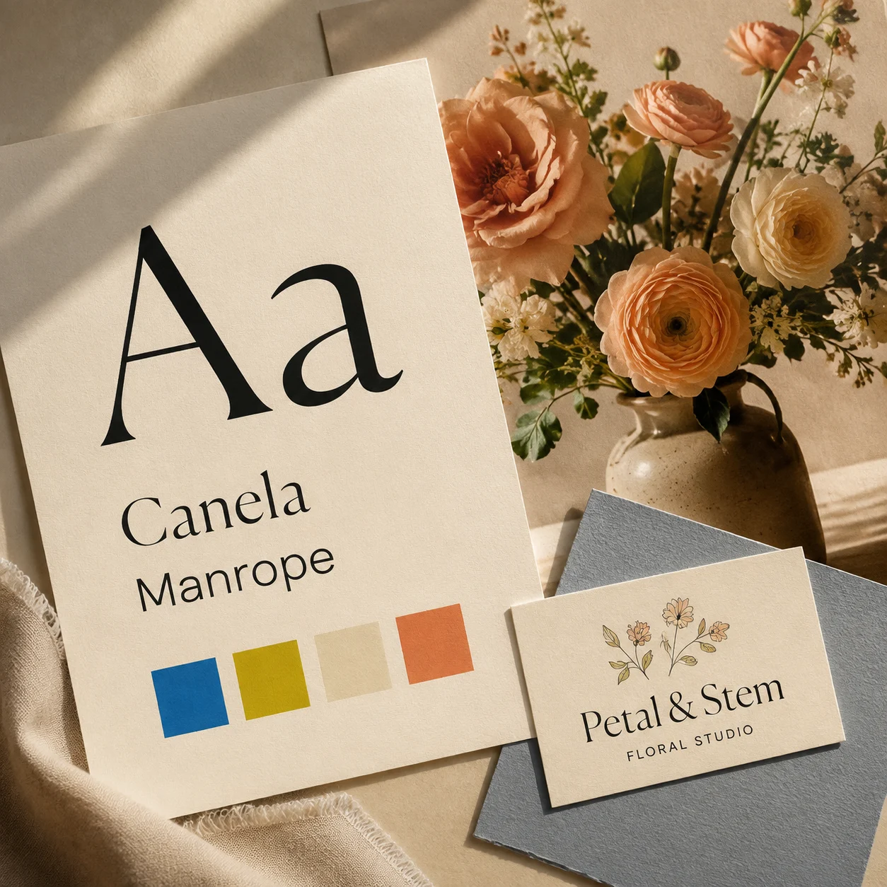
Colours and typefaces are often the first things people notice about a brand. They are also the easiest things to collect in a mood board. But the impression your business leaves comes from many small encounters: a product description, a booking reply, a delivery note. Visual choices matter most when they belong to a wider, recognisable way of doing things.
Start with what people can expect
Write down three things a customer should consistently experience when working with you. Make them specific enough to observe.
‘Friendly’ could mean explaining unfamiliar terms without making someone feel awkward. ‘Careful’ might mean confirming important details before starting work. ‘Straightforward’ could mean making the enquiry process and next steps easy to understand.
Then check these expectations against how the business currently operates. Keep the ones you can support, and identify where you need to improve. They will give your brand a practical foundation and help you decide which messages deserve space on your website.
Describe your voice through examples
A list of adjectives can leave plenty of room for interpretation. ‘Warm and professional’ might sound completely different to two people writing the same page.
Instead, draft examples of the messages your business actually needs: a welcome, a service explanation, a response to a common question, and an update when something changes.
Compare them. Are your sentences short or expansive? Do you use everyday language? How much humour feels natural? Keep a few examples as a small writing guide, including wording you would avoid and why.
Let the visuals support the message
Once you know what you want people to experience, review your visual choices together. A colour can look appealing on its own yet feel distracting across a full page. A typeface may suit a headline but be difficult to read in longer paragraphs.
Test your choices with real content: a product name, a service description, a button, and a photograph you genuinely plan to use.
Check legibility at phone size and avoid relying on colour alone to communicate meaning. Keep enough consistency that visitors can recognise headings, links, and actions without relearning the page each time.
Look at the whole customer experience
Walk through a typical interaction from beginning to end. Read the website, follow the enquiry route, review the reply, and look at any documents or instructions that come afterwards.
Notice where the tone or level of care changes. Does a welcoming homepage lead to an unclear form? Does your email explain what happens next?
Choose one inconsistency to fix first. Over time, this habit can make your brand more coherent than another round of colour adjustments. Recognition grows through repeated details that feel considered and dependable.